While the saying, “If it ain’t broke, don’t fix it” may hold true for some things, it’s not something you’ll hear Chobani say. Despite the Greek yogurt maker’s solid market-leading position, it has vowed to continue innovating both to maintain its place at the front of the pack as well as contribute to universal wellness. Among its recent innovations have been several new trend-setting Greek yogurt formats, among them drinkable versions and indulgent yet healthy snacks.
Affirms Leland Maschmeyer, chief creative officer, Chobani, “It’s very much a part of our entrepreneurial culture where we’re always looking to grow and evolve, not only to have a bigger impact but also to have more significant growth in the future.”
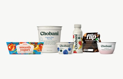
In 2008 Chobani became the first to introduce Greek yogurt to the U.S. market. In 2017, in preparation for its 10-year anniversary, the company refreshed the package designs for all of its 120-plus SKUs with graphics that tell the story of its brand with authenticity and with a sense of fun—both things it learned through extensive research that consumers were looking for.
As with any change, there were risks: “If [a redesign is] done poorly, you can alienate the people who love your packaging,” says Maschmeyer. “You can almost not look like the company they fell in love with, and you don’t resonate with them anymore. If you do it poorly and inauthentically, it can look like you’re trying to be something you’re not. But that all comes from working from a place of weakness, maybe being a brand that’s fallen behind and is eager and desperate to catch back up.
“This can also happen with brands that don’t listen to consumers, that don’t design from a place of authenticity. So there are quite a few things that you can get tripped up on. But if done well, a redesign can oftentimes be a significant boon to a company’s growth.”
With these dangers in mind, Chobani did its due diligence during the redesign process, thoroughly examining competitive sets of products—both inside and outside of the Greek yogurt category—distilling the values and heritage of its brand, and understanding consumers’ aspirations.
‘Fighting for Happily Ever After’
Much has been said about growing consumer preferences for simple, natural, healthy foods. But Maschmeyer says it’s not a recent trend; it’s just taken big companies a while to catch up with the shift, and for consumers to force that shift by voting with their wallets. “One of the great things about Chobani is that we were there from day one with our simple packaging and our very natural ingredients, really trying to make it feel like it wasn’t an artificial product, but something that signaled visually that it was made with homemade, natural ingredients,” he says.
What has changed in consumers’ evolving relationship with food, he says, is where consumers are looking for food to go. In the past, he says, it used to be more of a supply chain conversation and origin-story conversation about the food and the ingredients. Today it has evolved into a wellness story—“what role food plays in their life, and what it contributes to their life.”
In surveying consumers’ perception of the Chobani brand, Maschmeyer says the company found that, while their product is yogurt, their business is wellness. “People were seeing Chobani in a bigger light than sometimes we saw ourselves, and that informed quite a bit of the design. What people really loved about us is that we stood for higher values—values you could taste and you could see in our products. We stood for things beyond the product in the cup.”
To bring this vision of wellness to life in its new packaging, Chobani adopted the creative expression of “Fighting for Happily Ever After.” Maschmeyer explains, “It’s an internal mantra, a creative idea that we’re going to use in order to infuse and guide our decisions around all creative decisions, storytelling, and marketing. It’s derived from a new vision that we set for ourselves as a company. Stated simply, the vision says to make universal wellness happen sooner. It’s the idea that we want to do everything we can as a company to use our scale and resources to improve nutritional well-being in the country, to take care of the communities and the employees that are part of our family, and finally through our supply chain and how we manufacture our food, to do everything we can to protect and ensure the earth’s well-being.”
With this mantra in mind, Chobani translated the idea of universal wellness into a language that creative teams could work with to design the new packaging.
Handcrafted of highest importance
To give an idea of the scale of the redesign project, Chobani offers 11 product lines. That includes five Greek yogurt lines—Fruit on the Bottom, Blended, Drink, A Hint of Flavor (new), and Plain; three Flip lines, with the Flip format comprising a yogurt product on one side of a two-compartment cup and healthful or indulgent ingredients on the other; and two Kids lines, with fruit or with fruit and vegetables. From there, each line has multiple flavor varieties. For example, both Fruit on the Bottom and Blended lines have 13 varieties each, while Drink has 11.
What’s so impressive about this project is that 99 percent of the work was done in-house at Chobani and in the unheard-of time frame of eight months. “Typically, if you were to do this quickly in any other fashion than with an in-house team, it would still be a two-year project, and for some larger food companies, it’s a five- to seven-year project,” says Maschmeyer. “For this project, everyone rolled up their sleeves.”
One of the first goals of the redesign was to give each of the Chobani platforms its own identity. Over the previous 10 years, as each new product line was introduced, the company used the same graphics as it used for its original product. “What we saw was that while that created unity, it also blurred what the consumer was being invited to eat and to experience with each of the platforms,” says Maschmeyer.
In order to create a focus or strategy for each line, Chobani looked closely at how consumers were engaging with the platforms, assigning each of them to one of four distinct “buckets.” The first was products that consumers choose as good, healthy staples in their lives—products they eat every day. The second was food that consumers eat for fun. “Food should be entertaining,” says Maschmeyer. “It should be experiential. For products in this bucket, you can get some protein or some calcium, but it’s really about the experience of that food.”
The third bucket was performance products—those that consumers eat for certain functional benefits. And the last was the social side of food, products associated with family dinners, potlucks, barbeques, etc., “where food becomes a social currency that brings people together,” Maschmeyer explains.
One example is the Chobani Flip platform, which includes three lines with ingredients such as hazelnuts, chocolate chips, caramel bites and roasted peanuts paired with yogurt. “Flip was historically promoted as an all-natural, non-GMO, protein-rich product—sort of similar to the way all our Greek yogurt was promoted,” says Maschmeyer. “What we learned in our research was that with Flip, people are not reaching for the healthy side. It’s a nice benefit, but it’s not the reason they’re choosing it. People reach for it for the interesting, surprising, creative combinations of side-cart ingredients. That’s the driver. And they are eating it in place of things like candy or granola bars.”
Because of this, Flip was assigned to the fun, or experiential, food bucket, with the visual cues guided by the competitive set of candy and granola bars. Graphics for Flip dial up the creativity, fun, and playfulness, versus functionality cues, competing with other snack options consumers might reach for during the day. The background for each line is bold as is the artwork depicting the ingredients inside.
To allow for differentiation of the platforms while preserving brand unity, there were several design values carried across all the lines. As Maschmeyer explains, the design had to:
- Be handcrafted, “You had to see the human hand at work in the design.”
- Be approachable. “It couldn’t be so sophisticated that it looked too expensive.”
- Have a sense of naivety. “This is a brand with some innocence associated with it; there’s a sense of purity, a sense of nature. All of these things we thought could be beautifully suggested through a sense of naivety.”
- Have a sense of nostalgia.
Following these guidelines, each platform uses artwork done by hand. All colors are natural with a bit of nostalgic flair. No more pure white or pure black; instead, the designs use creamy or arctic whites or warm or cool blacks. All use a similar typography as well, although the way the information is laid out varies by platform.
“The difference really came in the specifics,” says Maschmeyer. “The specific art style we used on Smooth is different than the art style on Pour. Smooth was oils, Pour was watercolor. That flexibility allowed us to individualize each product while having it still come from the same Chobani visual voice.”
Another large piece of the redesign project was the creation of a new wordmark. To signify Chobani’s warmth and naturalness, the company moved to what Maschmeyer calls “a human typeface,” or one that looks like a human hand created it. It has curves, which are typically associated with organic gestures like leaves and flowers. Also important was making sure it had a heavy weight, so that a consumer can see it from 10 feet away, even on a crowded shelf. “That was super critical because what we know is that when consumers shop the shelf, the very first thing they look for is their brand,” says Maschmeyer. “With the old Chobani wordmark, when you stood ten feet away from a very crowded shelf, it disappeared. It wasn’t visually heavy enough to stand out.”
Chobani unveiled its new packaging in November 2017. Said Chobani Chief Marketing and Commercial Officer Peter McGuinness at the time, “As we approached 10 years as a national brand, we spent the past 10 years focusing on the impact our company can and does have on communities across America using food as a force for good. That’s framing how we’re looking at the next decade, and our new packaging is the first glimpse into that. It’s a beautiful translation of our brand and our purpose that moves us closer to becoming a food-focused wellness company.”