With new graphics that amplify the playfulness, wit and simple goodness of its brand, Snapple has moved beyond its traditional East and West Coast strongholds to ramp up growth in markets across the U.S. and globally. The comprehensive brand refresh was spearheaded by brand agency and retail design consultancy CBX.
“Snapple has a strong following on both coasts, and now it’s about reaching the center, so to speak, as it moves to boost household penetration throughout the country,” says Rick Barrack, Chief Creative Officer for CBX.
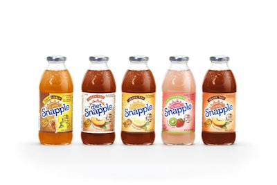
The brand refresh touches all Snapple products, including more than 20 different flavors of regular and diet teas and juice drinks. The new design is hitting store shelves now.
With a campaign that includes a hand-drawn New York skyline, the refresh emphasizes Snapple’s New York roots. Says Brent Chism, Snapple Director of Marketing, “New York consumers are some of our most passionate brand advocates—they absolutely love the great taste of Snapple—which is part of the reason our work with CBX included a strong focus on Snapple’s New York heritage. We want people all across the country to share this excitement about the brand because, although it was born in New York, it’s truly made for everyone.”
Adds Satoru Wakeshima, CBX General Manager, “CBX has been responsible for Snapple’s visual identity and packaging for the past 10 years.That’s a great honor that comes with the responsibility of respecting the brand’s heritage, maintaining what makes Snapple different, and continually evolving the brand to remain relevant in an ever-changing marketplace.”
The new Snapple logo includes a sun graphic in a hand-drawn style to provide the playful, natural character of the brand. The evolved logo also uses letterforms with a bit more movement and personality, yet maintains the curl of the iconic Snapple “S.”
Additionally, CBX created an Earth icon to embody “Made from the Best Stuff on Earth,” one of the brand’s long-lasting trademarked statements, dating back to its small Brooklyn storefront origins. “We wanted to make that statement more ownable,” says Barrack. “And we carried this element through to the top of the Snapple cap.”
The refresh included the use of flavor captions such as “Life’s a Peach,” “Lemon Large,” “Takes 2 to Mango,” and “Kiwi Meets Berry.”
“The captions help establish a sense of delight in Snapples great flavors,” notes Wakeshima, “and unlike its competitors, Snapple doesn’t take itself too seriously. These visual and verbal elements of the refresh work together for a uniquely engaging experience and add to the brand’s approachability.”