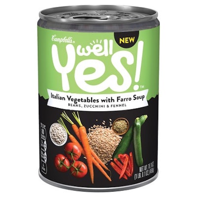
With its new clean-label line of ready-to-eat soups, Campbell Soup Company has made a massive departure from its iconic red-and-white can labels, introducing graphics that stand apart not only from its classic line of soups, but also from all the other brands on the shelf. The new Campbell’s Well Yes! line of nine soup varieties are made from “simple, real, and nutritious ingredients that people, know, want, and trust,” says the company, and are packaged in cans bearing labels that put those ingredients front and center in a joyful way.
“From the very early stages of this program, we realized that to succeed, every aspect of this brand needed to be different than the rest of the soup category—the food, ingredients, brand name, design, brand personality, etc.,” says Terry Schwartz, Director of Strategic Design at Campbell Soup Company. “As a small core team, we committed to think differently about every decision we made and held each other accountable to deliver that kind of unique brand experience.”
The Well Yes! line was eight months in development and features wholesome grains, meats, and vegetables, such as kale, quinoa, barley, sweet potatoes, and antibiotic-free chicken. The soups contain no artificial colors, flavors, ingredients, or modified starches.
In designing the graphics for the Well Yes! can labels, Schwartz says Campbell Soup had three goals: to differentiate the line from all other soup brands in the store; to convey the attitude of the brand’s target customer—“positive and engaged with food choices with a desire for deliciously crafted food made with nutrition-packed ingredients”; and to express the personality of the brand—“optimistic, joyful, surprising, yet grounded.”
Campbell Soup partnered with brand strategist Bulldog Drummond on the package graphics. Among the label design’s stand-out elements are the treatment of the unconventional brand name in a large script font, the rich and vibrant color blocks used for each soup variety, and the photographs of the food ingredients included in each variety against a black background.
The Campbell’s logo is positioned above the brand logo in very small type. “The size and location of the Campbell’s trademark was the subject of a lot of conversation,” explains Schwartz. “The Campbell’s brand has enormous positive equity with consumers. Yet, at the same time, we wanted to clearly communicate that the Well Yes! brand is very different from any other soup from Campbell. Those considerations led us to the existing size and placement.”
The paper labels are offset litho-printed by Hammer Packaging using an extended-gamut ink system that allows for accurate color matching of multiple colors without the use of special colored inks.
The 16.6-oz can itself is BPA-free. Explains Sophie Arsenlis, Director of Marketing, Soup Strategy at Campbell Soup Company, “Since March 2016 Campbell Soup Company has been using cans with linings made from acrylic or polyester materials, instead of BPA lining, and will continue to introduce new linings across its U.S. and Canadian portfolio through 2017.”
Since the Well Yes! line was introduced in December 2016, Schwartz says that they have had the intended effect on shelf: “Consumers who have responded have said the brand and label look contemporary, fun, vibrant, appetizing, and different than any other soup label they have seen in the store.”