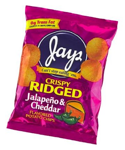
This year, the packaging for Jay’s salty snacks will undergo some subtle modernization, both in structure and in graphics. The goal, according to new owner Ubiquity Brands, Chicago, is to modernize the appearance of the packages while reinforcing the equity in the venerable brand.
Unlike when Jay’s was a brand name for the Japp family business in Chicago, the brand’s new management is a strong believer in consumer research. “Not many snack food companies believe in consumer research,” says Tom Reynolds, executive vice president for innovation at Ubiquity. “We feel the amount of time and effort we put into qualitative consumer research is directly related to our new products’ successes.”
In terms of its packaging, Reynolds says the company extensively studies what attracts consumers to a package. “We do a lot of focus group work with consumers,” he adds. That’s critical because Reynolds is heading up a total redesign of Jay’s products.
Along with making Jay’s packaging more appealing, the goal is also to make a stronger brand statement for its different varieties. “We didn’t have a cohesive look because each package had been developed when the product was developed,” Reynolds says. “If you lay our former packages side by side, you’d see a lot of different looks.”
Ubiquity retained Haugaard Creative to update the graphics—but only modestly. “Our consumers told us they loved Jay’s and felt they ‘owned’ the brand. They told us they believed it was made locally and so was fresher and had better taste,” says Reynolds. “And the brand’s tagline, ‘Can’t stop eating ‘em!’ is synonymous with the brand.”
Updating the look
“Our challenge was to keep as much equity of the existing package, while contemporizing the look,” says Phil Haugaard, president of the design firm. Working with marketers at Ubiquity, Haugaard decided to use transparent colors over the metallized look to bring a reflective look to the packaging.
Testing showed that consumers felt the reflective packaging indicated a more premium package, so Haugaard selected a series of transparent inks. “Because there are so many different products in the line, we had to find many colors in the palette,” Haugaard pointed out. “Plus we developed a ‘family look’ for each of the Jay’s brands, like Krunchers and Crispy Ridged, and all the colors have to be different.” Thus far only three of the Crispy Ridged flavors have been introduced in the new packaging.
Together with Ubiquity, Haugaard updated the Jay’s logo, by giving it some dimension. “We wanted to give it a three-dimensional look and make it more like a button,” Haugaard says, “and we added the tagline to the logo.”
“We’re trying to communicate that we’re bringing more life to the old, established brand,” Reynolds says. The new packaging is converted by Bryce Corp. A typical structure for Jay’s is 70-ga coextruded polypropylene/12# low-density polyethylene/70-ga metallized PP. The exterior PP is reverse-printed flexo in up to eight colors, says Dan Conley of Bryce.
Violators added, too
Ubiquity Brands was a new company in the snack food business last year. Chief executive officer Tim Healy first bought Lincoln Snacks in Stamford, CT, and then bought Jay’s two months later. Reynolds and Haugaard are also teaming up to improve the graphics for the Lincoln product line that includes Fiddle Faddle and Poppycock brands of caramelized popcorn.
Although the two companies distribute their products differently (Jay’s is mostly direct store-door; Lincoln is via warehouse), Ubiquity is now beginning to cross-sell the two lines with one goal being to make Jay’s Kruncher brand a national product line, according to Reynolds.
Even though Lincoln last year tried unsuccessfully to introduce a low-carb version of Poppycock, the company hasn’t abandoned the idea entirely. However, Reynolds says that its consumers aren’t pushing for healthy snacks. “They told us, ‘Don’t ever try to make me believe these products are good for us,’” he says. On the other side of the coin, he points out consumers also say: “If you can give me reasons to feel less guilty about being indulgent, I’ll love it.”
And that’s the main reason the new packages point out that Jay’s is trans-fat-free in a violator on the front panel. The products have always been trans-fat-free, but it’s never been promoted before. Much the same was true for Lincoln’s products, although a couple did need a slight reformulation.
“Now we’re highlighting that fact on our packages to help consumers feel less guilty about serving these products to their kids,” Reynolds says.
National from Chicago?
As Ubiquity looks to make Krunchers a national brand, the company recognizes that it may need to improve shelf life.
“We’re working with the University of Nebraska on a shelf life study to help us optimize our packaging,” Reynolds points out. “It’s likely that improved packaging will help us lengthen shelf life so that we can distribute Krunchers nationally from Chicago. But at the same time, we’re also looking at other opportunities via acquisition that could also help us expand our ‘reach.’”
Reynolds adds that Jay’s has doubled its kettle chip production, with spending of more than $10 million in total for 2004-2005. “We’ve also increased our bagging capability, too,” he says. And Ubiquity plans to open what it calls a “mega-distribution center” just behind the Jay’s production facility in Chicago with a tunnel linking the two. “With that, we can really automate the pack-off and palletizing operation,” Reynolds says.
So the new packaging graphics may really be just the first “bite” in Ubiquity’s plans to go national.