New Tool: ProSource
Checkout our packaging and processing solutions finder, ProSource.

Wow, baby--Gerber injects a little personality

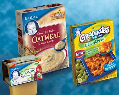
Icon brands that stay relevant and create symmetry between products in the brand “family” continue to endure in consumers' hearts. Gerber, a long-trusted brand, is a recent example with a new packaging system for all three of its lines, which help consumers to shop the category more efficiently.

Pw 9265 Gerber Group

At the same time, the new look updates the hallmark identifiers of the brand while also adding personality to the category.

The Zack Group (www.zackgroup.com) helped Gerber to relaunch all of its baby food sub-brands—from Infant to Organic to Graduates—with new product introductions and reformulations of existing ones. The “Gerber Baby” logo is modernized with a colorful pallete and strengthened in prominence while new packaging unifies the brand and allows for segmentation of categories within the line.

A prominent blue arch and appetizing product photography characterize the Infant line. The new Organic line, formerly known as the Tender Harvest line, adds a green band under the blue arch to help distinguish Organic from the base brand. Artistic food renderings emphasize wholesomeness. The package also improves communication of nutrition and health claims.

The Graduates line, for toddlers, emphasizes the new logo's prominent colors to create a bold and colorful palette, as well as systemized communications for entrees, snacks, and soups. Bright yellow signals the new identity across all Graduates products.

In addition, the blue Gerber arch endorses the line while the larger Graduates logo swirls around an icon of a star to give the sub-brand playful distinction.

Test Your Smarts
Take ProFood World's food safety quiz to prove your knowledge!
Read More
Test Your Smarts
Discover Our Content Hub
Access ProFood World's free educational content library!
Read More
Discover Our Content Hub