“A continuous circle.” That’s how Gina McCommon, vice president of The Double Cola Co., Chattanooga, TN, describes the family-owned operation’s process for revitalizing the package graphics for its line of five iconic carbonated soft drink brands. “We are always working on updating our graphics,” she says. “As soon as we finish working on one brand, we move to the next.”
Last March, after refreshing the design for its flagship Double-Cola variety, the company moved on to Diet Double-Cola, taking the opportunity “to really show consumers what this brand is all about—embracing individuality,” says McCommon. Double-Cola was born in 1933 and got its name from being the first major soft drink to be marketed in a package twice the size of its competitors. Today, the brand differentiates itself by eschewing slick, corporate graphics for a unique, handcrafted appearance.
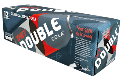
The rebrand for Diet Double was guided by consumer intercept studies that revealed that The Double Cola Co.’s target market is very interested in trying new brands and was attracted by the redesign. New graphics for the can and the 12-pack carton were created by goDutch and include interlocking circles of blue, black, and red; clean and modern typography; and hand-drawn illustrations and text that reads, “Never Settle for the Ordinary,” and “Hard to Find, Easy to Love.”
A tagline, “Surprisingly Diet,” is meant to attract consumers who are reluctant to try diet drinks because of the perceived “diet taste,” says McCannon. “In fact, we reformulated Diet Double a couple of years ago to make it take more like regular Double,” she says.
Commenting on the strategy behind the redesign, Megan Hallar, marketing coordinator for The Double Cola Co., says, “We wanted the graphics and the branding to match the personality of the brand...a little out of the ordinary, friendly, handcrafted, and different from other big-name colas.
“Our brand is a holistic expression, reflecting the unique combination of design, color, and imagery that brings our brand promise to life. Our interlocking rings symbolize Double’s perfect balance of carbonation and sweetness. The Double-Cola blue was chosen because it was different. In a sea of sameness, this unique color was one way of carving our space.
“We’re handcrafted and proud of it. The illustrations were hand-drawn to add playful elements that keep the brand fresh and unexpected.”
Cans are printed in four colors and are supplied by Rexam; cartons use five colors and are converted by Graphic Packaging Intl.
Diet Double-Cola is available in 12-cont cartons in several states across the U.S., as well as in some international markets. It can also be found in Cracker Barrel Old Country Stores nationwide.