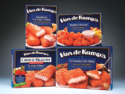
To capitalize on Van De Kamp’s heritage, designers updated its client’s logo and selected richer, deeper colors for an upscale, contemporary look. They incorporated a photo of the product to provide mouthwatering appetite appeal to attract Van De Kamp’s target market (adults). “Deutsch Design works delivered a fresh and tempting new look for Van De Kamp’s that truly sets us apart and establishes the brand as a family meal,” says Eric Grosgogeat, marketing director for Van De Kamp’s. Van De Kamp’s products are available at grocery stores nationwide.
Companies in this article