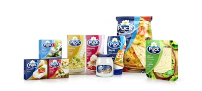
In June 2014, Arla Foods in the Middle East began the project of redesigning the packaging graphics for its entire 80-SKU line of Puck products, which include dairy and cooking products distributed globally. After hearing pitches from three design groups, Arla chose pi global to lead the project.
The primary objective of the redesign was to echo the new brand positioning of “mealtime joy everyday” and help moms provide a variety of tasty and enjoyable food solutions for every meal occasion. In addition, the brand needed to inspire, educate, and engage consumers in usage occasions and create new ones to help grow the category.
As part of the redesign, pi created a holding device on pack, known as the “Puck cradle,” which now forms part of the Puck visual equity toolbox. According to pi, the device creates an emotive connection between the brand and packaging and can be used holistically across all off-pack communications. In addition, it celebrates the idea of mom being at the heart of the family, always ready to share mealtime joy.
The color palette for the range is bold and playful, and the natural food photography conveys taste and cooking inspiration for moms.
Says pi, the creation of an extractable branding unit (EBU) allows the visual identity to be applied to any consumer touchpoint with ease, and the brand achieves powerful shelf impact with the use of one lead language for the brand name, communicating its international credentials.
With Puck’s previous packaging, navigating the various categories that the brand represents in-store was challenging for the Middle Eastern consumer, so it was crucial that pi understood all of the cultural nuances before the project started. Therefore, on-pack hierarchy, visual brand architecture, translation, and typesetting were all essential parts of the project.
“Puck historically did a great job of blocking at point of sale through a ‘blue wall.’ Unfortunately, what it didn’t give the consumer was a happy and easy shopping experience,” says pi global Chief Creative Officer Don Williams. “What we set out to achieve was to retain a strong Puck presence by locking up the visual Puck equities in a powerful and highly visible branding device, while freeing up pack real estate to focus on product information, food appeal, and positioning support.”
The range will be launched gradually into global markets beginning with the core products—white cheese and mozzarella. pi is continuing to work with Arla on a variety of new product development initiatives to ensure consistency and harmony throughout the Puck portfolio.
Says Safi Nomani, Regional Category Manager, MEA for Arla Foods, “It was a great pleasure working with pi global on the Puck Masterbrand project. Their dedication and immense branding knowledge shone throughout the Puck brand journey. pi dedicated a brilliant team to the project that was very quickly able to get on board and provide us with a comprehensive solution that will help us to succeed in the ever-challenging competitive environment in the Middle East. This was very well reflected in the consumer research we have undertaken across our markets where the response to the new design has been very positive.”