Michael Kurtz has a passion for chili pepper-infused honey, a discovery he made while living in Brazil in 2003. In 2011, the Brooklyn pizzeria where Kurtz was an apprentice, Paulie Gee’s, began using the condiment as a key ingredient in one of its pies. Responding to a demand for take-home packages, Kurtz began distributing his fiery blend—branded Mike’s Hot Honey—locally. But his packaging lacked the appropriate pizazz and failed to telegraph the unique nature of the product.
When in late 2015 an opportunity to scale for mass distribution became a reality, Kurtz enlisted Chase Design Group to bring on the heat with a distinctive and ownable package design. “Mike’s expectation was for Chase to create a design that captured his Brooklyn pizzeria roots, inspired consumers to pursue a variety of food pairings, and above all, conveyed the product’s uniqueness—that it is a HOT honey,” explains Chase Account Director Michelle Hoffman. “The existing packaging did not clearly convey this differentiating property. Mike also wanted the packaging to be able to live comfortably on shelf in both the honey and condiment categories.”
Among the elements of the previous packaging that weren’t working for the brand were a recessive color palette that lacked impact on shelf and minimization of the word “hot” without any other cues to support the differentiated flavor profile. In addition, the design, which used unrefined typography, a clip art-style illustration, and a glossy label, was not aligned with the crafted quality of the product.
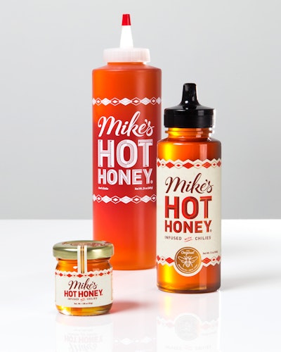
For the new label, Chase carefully considered each graphic element to evoke the craftsmanship and premium quality of the product as well as the personality of the brand’s founder, explains Hoffman. One element in particular that speaks to craft, authenticity, and Mike’s “old soul” character, she says, is the hand-drawn, vintage-inspired typography for “Mike’s” and “Hot Honey.”
Because the product uses a traditional honey bottle, Chase de-emphasized the honey cues on the label itself in favor of the brand, product name/attribute, and pairing occasions. A simple bee illustration encircled by copy in a copper badge at the bottom of the label conveys quality and marks the product’s position as the “original” hot honey. A diamond pattern across the top and bottom of the label is inspired by traditional pizzeria decoration. The label is a metallic paper with a matte laminate that is digitally printed in four colors plus white.
Says Kurtz, “This redesign perfectly reflects the pioneering role that I am trying to carve out, and I’m confident that it will help us gain space in the condiment aisle, where it belongs.”
The product is available in four sizes: a 1.88-oz glass mini jar, a 12-oz plastic bottle for retail, a 24-oz plastic chef’s bottle, and a 1-gal jug for commercial foodservice. It was rolled out in January 2017 in regional grocery stores, including Whole Foods Market, Central Market, and Fairway, and nationally in select specialty food retailers.