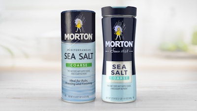
Morton Salt recently unveiled its first major packaging redesign in more than a decade. The new packaging for Coarse Kosher, Coarse Sea Salt, and Fine Sea Salt gives the brand a fresh, premium look to attract consumers and fuel the growth of specialty salts among home cooks.
Berlin Packaging’s Studio One Eleven was tasked with revamping the iconic blue fiber-wound package that’s been a ubiquitous fixture in almost every American household for more than 70 years. The new package needed to be cost-competitive with a legacy container that had been value-engineered for decades, slip seamlessly into Morton’s filling lines and, most importantly, enhance the brand equity Morton has been tirelessly building for more than 170 years.
Working hand in hand with the Morton product team, Studio One Eleven delivered a modern package that includes refreshed graphics for a bold, premium look that stays true to the Morton iconic brand colors. The idea was to stand out on grocery store shelves to break the routine of consumers shopping on auto-pilot and make them more conscious of the salts they were buying.