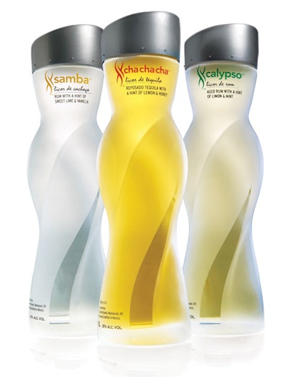
A new line of liquors targeted at “discerning female consumers,” SX appeared on Florida store shelves in June in a sensuously contoured bottle that suggests the exotic infusion of Latin-inspired flavors within. Developed by SX Latin Liquors of Fort Lauderdale, FL, the brand relies on a bottle with flowing feminine movement, designed by 4sight inc., along with exotic ingredients to deliver on a bold brand promise: “Your Drink. Sexier!”
The SX brand, which stands for “Sensual” and “eXotic,” includes three varieties, each named after a Latin dance: SXchachacha tequila, SXcalypso rum, and SXsamba cachaca rum. SX founder and CEO David Knight identified tequila for SX’s first product line because of its fast-growing popularity, but current lack of category innovation. “We wanted to introduce something that would grow the category and attract new users,” he says. “Key to that proposition was to produce a bottle that breaks industry norms and stands out.”
In development for nearly two years, the glass bottle, supplied by Pavisa in 750-mL and 1-L sizes, is a tall, slim column with feminine curves “intended to suggest the movement and passion of Latin dance, while also being reminiscent of the slit in a dress,” explains 4sight president Stuart Leslie. “The curvaceous bottle exudes pure sensuality and mystique.”
The entire container is frosted, except for one small, clear panel at the front to represent the slit of the skirt. The modern-styled silver cap, supplied by Tapones, features an artificial cork embedded in an injection-molded cap, making it easy to remove and replace.
Simple and elegant graphics at the top of the bottle, just below the cap, include color-coded typography that marries the logo with the three products. Designed at the same time as the bottle structure, the logo by Greg Stewart of Ingenuity Design mimics the flowing shape of the bottle, while rendering a combined “S” and “X” shape.