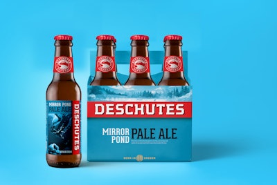
Needless to say, the craft beer landscape has changed dramatically, and the huge increase in competition, along with concerns of oversaturation and slowing overall consumption trends, has made growth difficult and innovation essential. That’s why Deschutes is rebranding with a simple and bold look aimed at recapturing its market and appealing to millennials who may not be familiar with Deschutes.
“If you look at the craft beer category now, it’s a sea of overwhelming visual noise,” says Simon Thorneycroft, Founder/CEO, of San Francisco‐based Perspective: Branding, the agency tapped for the rebrand. “The category is flooded by products and styles, all looking the same by trying so hard to look different. We saw an opportunity to create clarity at the shelf by putting the brand and style first, then layering in a bit of mystery through hidden stories.” These begin on the paperboard carriers with characters and illustrations that continue on the bottles depicting longevity, authenticity, and innovation, while also surprising and delighting consumers. “Elements of these stories start on one product, overlap, and continue onto the next product on shelf,” adds Thorneycroft.
“For clarity, we shortened the name on packaging to just Deschutes, which gives the name a bigger, bolder, and more iconic presence that equates with its heritage and legacy as a true pioneer. The new packaging design is a striking red and fresh blue, reflecting the colors of the soil and sky of Oregon, while also communicating refreshment, which is something often overlooked in most craft beer branding,” says Thorneycroft.
The new Deschutes packaging design system is rolling out now beginning with seasonal, Red Chair NWPA. The story on the new Red Chair packaging comes from the curious characters you meet while riding a chair lift at the mountain. These are unique moments when you connect with someone you might not otherwise meet – something that epitomizes the soul of Deschutes. Four different variations feature a skier or snowboarder with a person in flipflops, another in diving gear (a nod to their Mirror Pond packaging), a child in wellies, and Big Foot.
According to Michael LaLonde, President & CEO, Deschutes Brewery, “This packaging is much more visible, bolder, and has a deeper story connecting with the consumer. Our heritage brands look new and should lead to additional sampling and a lift for those brands as well.”