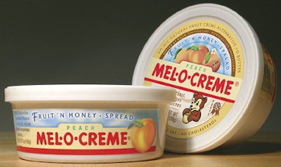
Position it as a healthful and less-fattening alternative to butter and cream cheese.
That’s what Melford Olsen Honey Inc., Cannon Falls, MN, has done. It restaged its Mel-O-Crème brand of honey spread—a fixture for 75 years in the upper Midwest—by altering the package size and materials, and expanding the package’s available color palette to intensify taste appeal.
Melford Olsen Honey takes this branding approach by working with Studio One Eleven, the design division of Berlin Packaging.
“First, we needed a new brand identity that would not only resonate in today’s market place, but also introduce new peach and raspberry SKUs,” says Curt Riess, Melford Olsen Honey CEO. “Second, because we are unknown everywhere except a few states, we needed a label that would tell consumers exactly what the pro-duct is and why they should buy it.”
Melford Olsen Honey selected a 7-oz polypropylene tub. The container matches the size of competing low-fat/cholesterol-substitute products and places the honey spread in store coolers. The new design also:
• Uses pressure-sensitive labels, from Viking Label, to broaden the available color palette and enable one stock lid and tub to be used for all three SKUs in the line. Melford Olsen Honey avoids locking into speci-fic quantities for each SKU without knowing the relative popularity of each flavor variety.
• Adds full-color illustrations of a honey dipper, raspberries, and peaches to intensify flavor appeal, distinguish SKUs, and communicate individual flavors.
• Incorporates text to signal the product’s uses and health benefits.
The tubs and lids, from Airlite Plastics, are flexographically printed in four process colors plus one line color.


