Packaging food products that are based on heritage recipes can be a tricky proposition. Put the product in a vintage-style container, and it can look stodgy. Update it, and you risk losing the handcrafted, good-for-you image. That was the challenge faced by Grandma Hoerner’s Foods, Inc. of Alma, KS, when it decided to refresh the packaging for its natural and organic Big Slice kettle-cooked apple slices, fruit preserves, pie fillings, and assorted salsa, sauce, and relish products.
Its existing Big Slice packaging consisted of a 26-oz glass mason jar with a gold lid and a three-side wraparound label that featured a small portrait sketch of the brand’s namesake, Grandma Hoerner, as a young woman. “The labels had an old-fashioned air to them that was consistent with the picture of Grandma,” says company Vice President Regina McCoy. “While we wanted to stay true to our roots, we knew that today’s consumers have smaller families, and the large jar sizes we packaged our Big Slice apples in were just too big for them.”
Knowing that its Big Slice product line was also set to debut nationwide in retail stores such as Target in a 4.5-oz flexible pouch with modern graphics in vibrant colors, Grandma Hoerner’s also wanted to update its jars to ensure consistent branding of its products.
McCoy admits that the refresh was long overdue: “We had heard feedback for years at trade shows about the look and feel of our products. While we were being authentic to our roots, we had a ‘Cracker Barrel’-type feel, and we heard from our customers that they were looking for something more modern.”
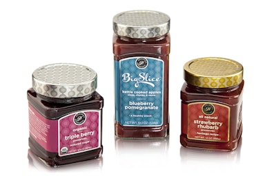
The new package, facilitated by Berlin Packaging’s Studio One Eleven design division, starts with a custom rectangular 19-oz glass jar with pedestal-like detailing at the shoulder and base—a noticeable difference on-shelf from the round bottles that dominate the category. A 14-oz and a 12.5-oz square version is used for preserves. The straight-walled jar also allows for more packages per pallet, reducing international shipping costs.
A three-sided, wraparound label, positioned in a recessed area on the container’s front, back, and side, decorates the jar, while brand embossing decorates the fourth side, bolstering the impression of a product with a special provenance. Label graphics align with those used on the pouch and include a contemporary single-color polka dot-patterned background—with color dependent on variety. Silver or gold lids repeat the pattern. Replacing Grandma Hoerner’s likeness on the label is a seal-like logo bearing the letters “GH” in an elegant, modern script, along with the brand name. Says McCoy, “Overall, we wanted to simplify, modernize, and be ready to go global with our branding.”
The new packaging launched in early 2015 in 5,000-plus stores nationwide, and is being used for Grandma Hoerner’s Big Slice apples and fruit preserves, and its new 19-5.oz Gourmet Ready to Go! sauces. McCoy says the company is currently working to move all of its products to the new design.
