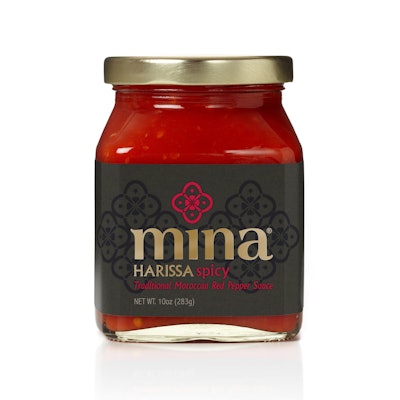
A stylized red bell-pepper design influenced by Moroccan tile patterns and shapes serves as the brand icon for the debut product from Casablanca Foods of New York City. Launched in spring 2011, Mina Harissa is based on traditional Moroccan harissa red pepper sauce, but has been crafted to the unique taste and style of the founder’s mother, Mina. The condiment’s six key ingredients—red pepper, chili pepper, garlic, salt, oil, and vinegar—are cleverly represented in the icon, which serves as the main graphic element of the new product’s packaging.
The visual appearance for Mina Harissa was developed by brand design partnership Monday Collective, which was guided by founder Fouad Kallamni’s expectations “to have a world-class identity and design that differentiates on-shelf while telling an authentic Moroccan story,” Kallamni relates.
To gather inspiration and ideas for the product packaging, Monday Collective co-founder Rochelle Martyn says the firm tapped into the client’s, as well as another expert’s, extensive knowledge of Moroccan culture. “We reviewed design inspiration from traditional Moroccan patterns, shapes, colors, and type, as well as looked closely at Moroccan cuisine and other cultural influences,” she says.
The resulting package is a 10-oz square-shaped, stock glass jar, with a gold metallic screw-on lid. A wraparound pressure-sensitive label uses a dark grey background that is decorated with two clusters of the bell-pepper icon in black. The Mina Harissa brand name is centered in gold on the front panel, above which is a single bell-pepper icon. This icon appears in red, orange, or yellow, depending upon whether the variety is spicy, medium, or mild, respectively. Copy at the bottom of the jar printed in the corresponding color further identifies the flavors. Precision Label printed the labels in three colors, plus a spot varnish for the background pattern and a gold foil for the logo.
As for the exact representation of the ingredients in the icon, Martyn explains: “When a red bell pepper is cut in half width-ways, it forms a rounded, almost floral outer shape similar to that found in traditional Moroccan tile patterns. …Four chili peppers form the cross, and in between each is a clove of garlic. In the center of the icon, there are four dots representing salt, and the four droplet shapes inside each curve represent oil and vinegar.”
According to Kallamni, Monday Collective struck just the right balance of tradition with a contemporary flair for the packaging: “Monday Collective created an exceptional design for Mina Harissa, beyond expectations,” he says.