Amway Corp. is an $11.8 billion direct-sales corporation based in Ada, MI, that distributes consumer products in more than 100 countries and territories worldwide. Among its brands, the Satinique portfolio of haircare products—with its emphasis on the nexus of health, beauty, and hair—offers a universally appealing solution that is popular across the globe, especially in countries such as Russia, China, and Southeast Asia.
Satinique’s point of differentiation is its proprietary ENERJUVE Complex, which Amway says was developed specifically to isolate where hair is at its weakest and then bind to it from the inside out, to strengthen, repair, and restore its original state of health. The result is hair that is energized and rejuvenated “from root to tip,” the company says.
“Amway’s deep commitment to scientific innovation elevates Satinique to be among the best haircare brands on the market,” says Amway VP Global Beauty Maud Pansing. “We’ve raised the bar in the category with technology and performance in the formulations that truly make a difference to the health of hair, inside and out.”
In 2010, recognizing that the spare, white packaging it was using for the Satinique portfolio was not bringing the brand story to life, Amway began a project to redesign the packaging to help the brand remain relevant, contemporary, and fresh for years to come. Working with global brand agency CBX, Amway conducted consumer research to tap into the universal preferences of premium haircare brands around the globe.
First launched in 2013 in Japan, the redesigned Satinique package is a sleek, feminine bottle structure with a premium feel that uses vibrant, jewel-tone colors to differentiate need states and convey the brand’s rejuvenating, revitalizing aspect. Says Allison Koller, CBX Creative Director, “It was a very involved process, but we are extremely happy with the results.”
Modernization, consistency needed
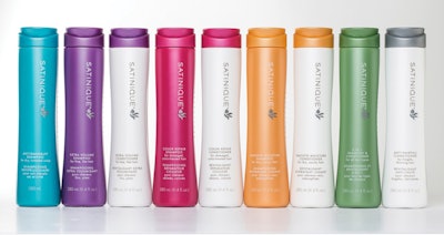
The Satinique portfolio consists of nine cleansing and four conditioning products as well as a range of styling gels and serums, final-touch sprays, mousses, and other styling products. Among the need states addressed are Color Repair, Thickening/Anti-Hairfall, Extra Volume, and Revitalizing/Anti-Dandruff, among others. Most shampoo and conditioning products are available in a 9.4-oz and a 25.6-oz size; the 9.4-oz was the main focus of CBX’s structural redesign.
As Koller explains, the overhaul of Satinique’s packaging was undertaken for a few reasons, but primarily to modernize the brand. “I would say the existing packaging was about 10 to 15 years old,” she explains. “It was an oblong bottle with a simple flip-top cap. The majority of the line was very white, with a kind of semi-serif typography for the brand mark and all the information on the pack. Over the years, it began to look a bit dated.
“Amway had also innovated over time without considering a design system for the collection of products. The packages started to feel like one-off SKUs versus having a really strong color-coding system. They had also attempted to introduce some icons for different need states within the portfolio, but there wasn’t consistency of application there either.”
Another reason for the redesign was to provide Amway sales representatives with a brand story to share with their consumers. As mentioned above, Amway also wanted a package that would appeal to a newer and more global consumer base. A final driver was the introduction of new formulas and the opportunity to rationalize the portfolio.
All of these factors made the redesign a unique and challenging project for CBX. Says Gregg S. Lipman, Managing Partner at CBX, “Because Amway is an $11.8 billion company with a vast network of global customers and distributors, the structural positioning and graphics also needed to be universally appealing. And since Amway customers receive products direct from distributors rather than shopping for them at shelf as with a typical CPG, the design considerations were a bit different as well.”
Homing in on consumer preferences
The first step in the redesign process was to conduct global research to identify packaging characteristics that were globally appealing to Amway’s diverse customers around the world. This was followed by an audit of the premium or prestige beauty and haircare category internationally to understand how people in diverse markets think about product aesthetics and even portfolio mix in the category.
“It really required some good research in terms of understanding what’s happening in each market and what women are accustomed to in terms of communication about beauty and personal care products. It involved looking deeply at other brands within the same space, then reaching beyond that into the world of fashion and beauty, and then trying to see our similarities in each of those regions.”
The research, along with quantitative testing, revealed that consumers consistently favored a simple, sleek, and streamlined design—in both package structure and graphic elements. Using that information, CBX created a 9.4-oz, multilayer high-density polyethylene bottle structure with an elongated, feminine form that suggests an upward sweeping movement. The cap is positioned flush with the slim, cylindrical bottle, resulting in a clean silhouette. “It came down to the sleek and streamlined nature of what it means to be more premium in the global haircare space,” says Koller.
The bottle offers functional benefits as well. Because of its slightly hourglass, ergonomic shape, it creates a comfortable feeling in the hand and provides an easy grip in the shower. The bottle, with a middle layer of post-consumer recycled HDPE, is supplied by Axium Plastics, while the cap is from Menshen Packaging USA.
Conveying energy through color
Through consumer research, CBX not only learned that consumers prefer simple, clean graphics, but they were also able to identify those colors frequently associated with different need states in the haircare category. For example, pinks, oranges, or reds are often associated with formulations for colored hair, while silvers and blues cue anti-dandruff or multipurpose formulations.
To convey the rejuvenating nature of Satinique, CBX selected a vibrant jewel-tone and metallic color palette with premium finishes for the bottles. Each cleansing variety is differentiated with its own color for bottle and cap: purple for Extra Volume, red for Color Repair, and silver for Anti-Hairfall, for example. The complementary conditioning product is packaged in a white bottle with a matching, color-coded cap.
According to Mimi Anderson, Global Lead for Satinique, the biggest challenge associated with manufacturing the bottle was the time it took to color-match the jewel-tone colors. “The vibrancy is obtained by using one color in the outer layer, and a second unique color in the middle layer. Color matching was time consuming, but it was shortened by the colorant supplier’s ability to blow-mold three-ounce sample-sized bottles in their R&D facility for us to approve, which saved us a lot of time.”
For the bottle’s graphic design, CBX created a new brand mark that consists of the Satinique name in capital letters in a clean, sans-serif font, with a customized “Q” that turns into a droplet, “building on the idea of a ‘secret sauce’ with a magic ingredient that brings rejuvenation and revitalization to your hair,” says Koller. An additional visual element calls to mind wisps of free-flowing hair. The brand mark runs vertically along the front panel; the variety descriptor is at the bottom, in both English and French.
While CBX primarily focused on the redesign of the cleansing and conditioning product packaging, Koller says that they also worked on the packaging for Satinique’s styling products, which will ultimately comprise 30 SKUs. The styling products use stock containers with similar clean-sided silhouettes, and are colored a soft silver, with touches of color to signify the need state with which they pair.
A new brand story
Through the combination of an elegant, simple bottle structure that conveys a premium product, an ergonomic shape, and jewel-tone package colors that suggest energy and vibrancy and differentiate need states, Amway has met its goal of providing sales reps with a compelling brand story to share with consumers.
“The new design gives them much more of a handle on that storytelling piece, for example how that bright, beautiful raspberry color translates to keeping gorgeous color in your hair,” says Koller. “Hopefully we are telling a story like that about each of the products, and the design should become a showpiece for that.”
Since its launch, the new Satinique product line and packaging have been very well received—exceeding Amway’s expectations, says Anderson. “The talk is all about how these amazing new formulas are truly making a difference to the health of their hair,” she says. “The exclusive and addictive fragrances have become favorites with men and women, while the simple elegance of the packaging delivers on both form and function.”
The design community has also taken note of the new package design, Anderson adds. In 2014, Satinique received top honors in the haircare category of the HBA International Package Design Awards.