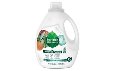
Seventh Generation Unveils Its Largest Rebrand Ever
The new visual identity includes all of the brand’s touchpoints, including new packaging designs for 200 SKUs. Graphics include an evolved leaf logo and evocative, molecular-inspired illustrations.
Household cleaning, paper, and personal care products company Seventh Generation has smartened up its appearance when it comes to how it shows up for consumers on shelf and in their homes. In April 2022, the company restaged half of its 200-plus SKUs in new packaging as part of the largest brand evolution in the company’s 34-year history.
The new visual identity, which encompasses all of its touchpoints, including its website, in-store materials, and e-commerce assets, as well as its entire packaging portfolio, was undertaken, says Seventh Generation Art Director of Packaging Tomlynn Biondo, to evolve and modernize the brand logo and connect Seventh Generation’s products in a system that was ownable and flexible.
“Previously, our brand was severely lacking ownable assets, other than our logo. It was the only element we had that connected our brand presence,” she says. “We had too much going on and not enough resonating strongly enough to carry our identity. This was my mission when I started working at Seventh Generation eight years ago: I wanted our portfolio to be unified under a flexible visual system. I wanted to distill down our assets, create a solid brand book, and give more ownership and responsibility to the internal Creative Team.”
To create the new brand assets, Seventh Generation worked with Design Bridge London. One directive to Design Bridge was to retain, but evolve, the logo. “The only asset we owned that we knew we wanted to keep was our leaf logo,” says Biondo. “We knew that consumers saw us as ‘the green leaf brand,’ and we didn't want to confuse or lose our dedicated consumers. We did, however, want to evolve the leaf to be more reflective of our brand and mission.” Another ask was the modernization of the brand, which had begun to feel a bit “stale and overlooked,” she adds.
As Michael Stride, Creative Director at Design Bridge London, explains, redesigning the visuals for an iconic brand such as Seventh Generation requires careful consideration. “The main challenge is delivering a meaningful balance between retaining the recognition and strength of the current look and feel of the brand while bringing a fresh perspective to it,” he says. “It’s about harmony, staying reassuringly recognizable to those who already know and love the brand, but bringing modernity and something new for those users. It’s this push to connect with a new audience that becomes the real creative opportunity.”
To gain context for the redesign, Design Bridge studied consumer responses about the brand, its products, and its competitors. It then explored the stories about Seventh Generation, its proposition, and its products to define its personality and difference. “We used this to build creative territories with images and words that would inspire new creative outcomes, stress-testing these ideas to understand how we’d tell product stories of efficacy or brand advocacy, etc.,” explains Stride. “Ultimately this approach informed the new visual strategy for the brand and its design, delivering something authentic, modern, and differentiated.”
Design Bridge’s goal for the iconic leaf logo was to evolve the element and imbue it with greater meaning. Given Seventh Generation’s stated mission to “transform the world into a healthy, sustainable, and equitable place for the next seven generations,” Design Bridge recrafted the logo with seven leaves. Says Stride, “The leaves come together to create one, holistic considered whole, giving greater meaning and flexibility for the identity to exist online, in-store, on-pack, and in the mind.”
Design Bridge also created a redefined logo typography that Stride explains embraces the tension between nature and science, where the word “Seventh” embodies a sense of nature through the use of a softer, more organic-inspired typography, and “Generation” taps into a more powerful and efficacious feel, through a stronger and more robust type style.
Along with the evolved logo, the design system includes two other key elements: a grounding tab and a circular “molecular structure”-inspired holding shape. The latter comprises images within three overlapping circular boundaries that highlight the molecular, plant-based components that drive the efficacy of Seventh Generation’s products. “This circular system works within our visual identity system, to both hold and highlight the products’ natural ingredient credentials and superiority plus the product benefit visuals, in a way that feels ownable to Seventh Generation,” says Stride. “We built a visual language that reveals the inner workings of the products, to offer an abstracted and beautiful glimpse into the power of nature.”
These ownable icons also allow consumers to easily understand the individual benefits of each product and navigate the large range of product varieties on-shelf.
For the April rollout of the new design, Seventh Generation concentrated mainly on its homecare products, such as laundry, dish, and household cleaners. “Eventually, all of our products will be refreshed over time,” says Biondo. “At this point, we’ve redesigned the front and back labels for over 100 SKUs. Our senior production designer is never bored! We’ve got over 200 SKUs in our portfolio, so we’ve still got a ways to go.”
Of the new design, Biondo says that Seventh Generation and Design Bridge definitely met the two main goals of the project: consistency and modernity. “As the art director for our packaging, I had concerns about the lack of consistency within our portfolio, especially between our categories,” she says. “Our products seemed disjointed and lacking that red thread to tie everything together. As a brand strategist, this didn’t sit well with me.
“The rebrand was our catalyst—our big opportunity to allow our entire portfolio, across all channels, to sing. I’m delighted with where we are, because we’ve created smart, distinctive brand assets that speak to our roots and point of differentiation. From the upright, authoritative leaf logo to the cleaned-up packs, consumers are embracing this evolution.”
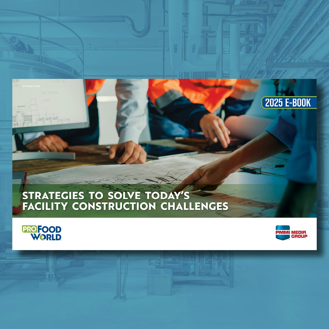
See how leading manufacturers are fast-tracking projects despite economic uncertainty. Get proven tactics for overcoming tariffs, labor shortages, and rising costs.
Discover cutting-edge packaging and processing solutions in the inaugural Packaging World/ProFood World Innovations Report. From high-speed filling machines to mono-material lids, see how the latest advancements from PACK EXPO International 2024 are driving safety, sustainability, and extended shelf life—shaping the future of dairy food and beverage packaging.