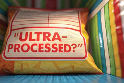
From Window to Workflow: Prospector Redesigns Pouch for Scale
As distribution expanded beyond regional retail into national grocery and hospitality channels, Prospector Popcorn replaced its windowed pouch with a metallized structure and macro photography, aligning graphics, materials, and operations for consistent shelf performance and shelf life.
Prospector Popcorn’s redesign replaces a transparent window with macro product photography, while moving the flavor name to the center of the pouch for improved shelf visibility and consistency across distribution.
For years, Prospector Popcorn leaned into a familiar flexible packaging playbook: a stand-up pouch with a transparent window that showcased the product inside. For a handcrafted, gourmet offering that simply looks delicious, the approach made sense--especially for a young brand trying to build trust.
But as distribution expanded beyond tightly controlled retail environments, that same window began to undermine the product it was meant to highlight.
“Product settles,” says Adam Ingberman, director of digital marketing at Prospector. “These perfectly photogenic bags that were leaving our care… they got moved and so it settled.”
As pouches moved through wider distribution and experienced all of the attendant vibration, handling, and repeated merchandising, the freshest popcorn shifted in the pouch and ingredients/toppings smeared against the window. What started as a full, visually appealing presentation became inconsistent, sometimes sparse, and ultimately less appealing on shelf.
At the same time, another issue emerged: flavor communication.
“You give it to five different retailers on five different shelves, and at times the flavors were getting blocked,” Ingberman says.
With flavor names positioned low on the pack and the window dominating the visual field, merchandising variability meant consumers often couldn’t distinguish between varieties.
Those combined pressures—distribution reality and shelf inconsistency—triggered what Ingberman describes as a “generational change” in packaging.The 3.5-oz pouch anchors Prospector Popcorn’s core retail offering, with a matte-finish, digitally printed structure that supports rapid flavor iteration across a broad and frequently changing SKU set.Prospector Popcorn
Replacing the window with controlled imagery
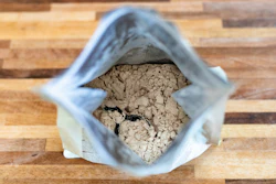
The ensuing package redesign eliminated the window entirely, replacing it with macro photography of the product. But this wasn’t stylized, studio-enhanced imagery typical of snack packaging.
“We opened production bags that were otherwise heat sealed and poured them out,” Ingberman says. “We selected from that batch, but that was real product that was going to people and not limiiting ourselves to only the best ones.”
The team established strict rules around authenticity. No digital retouching was allowed, even at the expense of visual perfection.
“If a piece had a break in it… and we thought it wasn’t suitable for the bag, we didn’t patch it in Photoshop, it was rejected,” he says. “No retouching.”
That decision reinforced a key design principle: if the window was being removed, the replacement needed to preserve trust while delivering consistency.
The new layout also corrected the flavor visibility issue. Flavor names moved from the bottom of the pouch to a central, dominant position.
“You can see how the flavor name moved up to the middle of the pouch… that’s the biggest change,” Ingberman says.
The result is a more controlled, repeatable shelf presence that no longer depends on if or how product settles inside the bag.
The redesign also preserved one of the brand’s more recognizable elements: its hand-drawn graffiti. Originally created in-house, the illustration carries over to the new pack, but with a subtle shift in execution. With the window removed, the design is no longer constrained by rigid geometry, allowing the artwork to take on softer, more curved forms that better frame the updated layout.
Structure shift: From windowed EVOH to metallized barrier
The visual redesign coincided with a structural change in the pouch itself.
The previous package, produced before Prospector transitioned to digital printing, used a soft-touch PET laminated to a clear EVOH polyethylene structure. The EVOH layer provided barrier performance, while the transparent section enabled the window.
By contrast, the new structure removes the window entirely and adopts a fully opaque, metallized lamination:
Reverse-printed PET outer web
Metallized PET (METPET) barrier layer
Adhesive lamination
LLDPE sealant layer
The metallized layer is sandwiched between the printed PET and the polyethylene, with adhesive lamination bonding the structure.
This shift brings a more uniform barrier across the entire package. While the company initially questioned whether the window was compromising shelf life, Ingberman notes that in practice, the window wasn’t definitively the root cause. Still, the move to a metallized structure eliminates variability in barrier performance across the pack.
The new pouches are produced by converter ePac using digital printing, a change from the previous analog process.
Digital printing enables SKU flexibility
With roughly 30 production flavors and a steady cadence of seasonal and regional offerings, Prospector faced growing SKU complexity. Digital printing provided a way to manage that variability without the cost and lead time involved with having to machine bespoke metal printing plates.
“It’s been helpful,” Ingberman says, particularly as the company introduces limited-time seasonal flavors like pumpkin spice or regionally tailored offerings such as banana pudding in the South.
That flexibility also supported the introduction of a new 1.5-oz stand-up pouch, designed for grab-and-go channels such as convenience stores, cafés, and hospitality settings. While visually aligned with the 3.5-oz retail format, the smaller pack required its own design pass to maintain readability and hierarchy at reduced scale. Not all flavors made the transition; in some cases, product format and mix-ins influenced whether a variety was suitable for the smaller size. The result is a more channel-specific packaging strategy, rather than a simple one-to-one extension of the core lineup.Enabled by digital printing, the 1.5-oz format extends the brand into grab-and-go channels such as cafés, c-stores, and hospitality, where smaller runs and channel-specific designs can be produced without the constraints of traditional plate-based printing.Prospector Popcorn
Matte finish and color control
The new pouch also adopts a matte finish, a deliberate departure from gloss. Achieving the brand’s specific black tone became a focal point during development.
“Our graphic designers were hyper-focused on our original Pantone black and felt they could achieve it with the matte,” Ingberman says, noting extensive iteration with ePac to dial in the color. "I learned a lot about the many forms of the color black," he jokes.
The matte surface not only supports color fidelity but also reduces glare under retail lighting, reinforcing the premium positioning.
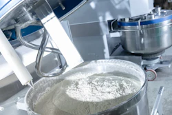
Packaging operations: balancing automation and mission
While the packaging itself evolved, Prospector's production philosophy adds another layer to the story.
As a nonprofit focused on creating employment opportunities for people with disabilities, the company approaches automation cautiously.
“When we think about speeding the production line or automation, we’re always trying to strike a balance,” Ingberman says.
The operation currently uses pre-made stand-up pouches supplied by ePac. These are filled using a system that includes a Powell Systems Integration (PSI) Model 106-NW net weigher, with pouches loaded into a magazine 100 at a time, and filled before heat sealing.
The line includes a resealable zipper feature that's heat sealed into the premade pouch structure before arriving at the facility. Final seals are applied after filling.
Historically, much of the packing process has been manual. However, the company is in the process of bringing an automated bagger online.
“It didn’t require it… we could have continued with our handcrafted hand packing,” Ingberman says. “But… we’re just getting our automatic packer up and going.”
Once fully operational, the system is expected to roughly double throughput, helping the company scale while redeploying labor to other tasks.
Current production capacity is approximately 10,000 bags per week under normal operation, with higher surge capacity available. Finished goods are case-packed into corrugated in 12-count configurations for both 3.5-oz and 1.5-oz formats.
Downstream automation, such as case erecting, packing, and palletizing, remains largely manual for now, though Ingberman acknowledges these as future opportunities.
“We just recently shipped a large order and all we talked about was a shrink wrap machine,” he says.
Designing for uncontrolled retail environments
The redesign ultimately reflects a shift in mindset: from designing for ideal presentation to designing for real-world conditions.
In controlled environments, the window conveyed authenticity. At scale, it introduced variability.
By removing it, Prospector traded spontaneity for consistency—then rebuilt authenticity through photography, messaging, and design.
The new packaging system aligns graphics, materials, and operations around a single goal: ensuring the product looks as intended, regardless of how it moves through the supply chain.
And in doing so, it demonstrates a broader lesson for packaging professionals—sometimes the most intuitive feature on a package isn’t the most resilient once it leaves the plant.
By the way, that broader distribution the new package is meant to handle is already taking shape. Prospector Popcorn is now on shelves at retailers including Big Y, Wegmans, and ShopRite, while also expanding into hospitality channels through hotel partners such as Marriott and Hilton—many of which have made commitments to sourcing from socially responsible organizations. In those varied environments, where merchandising conditions can differ widely, the redesigned pouch reflects the company’s shift toward packaging that performs consistently beyond its point of origin.
Filling speeds, seal integrity, contamination control — our editors found the liquid foods innovations that matter. See what's new and get ahead of the competition. Download your free report now.

 The 3.5-oz pouch anchors Prospector Popcorn’s core retail offering, with a matte-finish, digitally printed structure that supports rapid flavor iteration across a broad and frequently changing SKU set.Prospector Popcorn