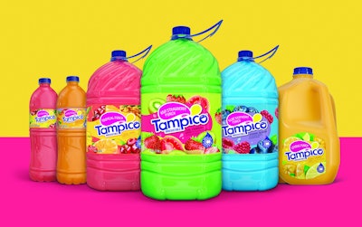
Tampico is a leading brand of juice drinks in the U.S. and countries around the world. But even market leaders need to step up their game now and again to remain relevant. In 2016, after 15 years without a change in its package graphics, Tampico saw an opportunity to make its offering more accessible to the consumers of today by bringing the brand up-to-date and leveraging a more contemporary look and feel.
Says Alysha Balog, Senior Designer at Equator Design, the firm responsible for the Tampico brand revamp, “Tampico saw the opportunity to maximize positioning with their consumer heartland while aiming to secure greater buy-in from a wider audience. The graphics, though splashy and colorful, needed to be more approachable, and the logo required a refresh.”
The target consumer was young, value-seeking moms and their families, but Equator also needed to keep in mind a secondary consumer, young adults, “as that market share continues to be strong and aligns well with Tampico’s growing assortment of single-serve bottles,” Balog explains.
Equator utilized its resources to gather data to help in the redesign. As Equator Senior Designer Josh Weigelt shares, the firm did an audit of the U.S. retail space, along with an audit of independent companies, stores, and product trends that influence the retail space. It then broke down the beverage/snack drivers and the graphic language of flavor and scent from all categories, followed by a deep dive into the competitive set.
In exploring the graphic language of color and flavor, Equator gleaned “how expressive brands can be while being along a spectrum of literal to abstract,” shares Equator Creative Account Manager Andrea Howard. “Functional items like laundry products are very literal and much softer in their approach, but as items become more treat-like, for example, a unique lip balm flavor, the colors get punchier and the imagery more abstract,” she explains.
Harnessing the information gleaned from the research, Equator crafted a positioning statement and three brand pillars from which each label design took its cues. The three main design elements of the Tampico architecture are the logo lockup, the fruit illustration, and the flavor colors. The idea behind the new logo is that Tampico changes any occasion with its twist on juice and unexpected flavors; it is loose and fun, but still grounded with modern letterforms.
As Weigelt explains, “imaginatively curious”—the name of the design concept but not adopted as brand language—is expressed in the logo through the uneven strokes of the letterforms and slightly jumbled-up characters. “The letter ‘o’ is converted into a smile icon that conveys the fun found in Tampico juice drinks,” he elaborates. “The splash illustrations above the letter ‘i’ are intuitive to the product’s nature. They make the brand mark look juicy at first glance. And, the strategically placed curved corners add movement and approachability to the logo. The large splash at the top is also functional, as the magenta build aids in printability for the flavor name, while also bringing the flavor name to the top of the pack, knowing that the gallon jugs sit in the well of the refrigerated section and can peek over the edge to aid in shoppability.”
The logo lockup contains all of the primary communication on-pack and acts as a visual anchor across the line. It sits within a field of color that Howard says is affectionately referred to as “the blob.” The blob, she explains, acts as a quiet space for the primary communication as well as the main hit of color for each flavor. Flavor colors are bright and lively to capture the essence of each fruit variety.
Bursting from behind and in front of the blob are fruit illustrations, painted in-house to ensure quality and consistency across the brand. “The illustrations are playfully flowing around the label, intermixed with graphic splashes and swirls, adding to the fun nature of the label,” says Howard.
Equator designed a variety of new Tampico labels across all of its SKUs. To accommodate the variety of packaging formats, printing capabilities, and multiple translations used for Tampico around the globe, the firm built a flexible design architecture with an extensive style guide and a toolkit of visual assets. “In this way, the brand can flex to fit the needs of a specific project, without diluting the equity of the brand,” Balog says.
The redesigned package graphics for Tampico were unveiled at retail in summer 2018.
