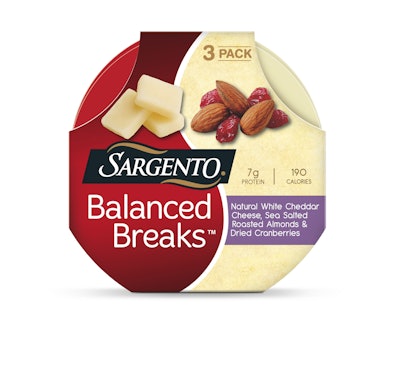
Healthy and satisfying, sweet and savory, taste and nutrition: These are the concepts Sargento Foods Inc. sought to communicate with the packaging for its new Balanced Breaks line of cheese, nut, and fruit snacks. Created to meet the growing trend of snacking, especially among Millennials, as well as consumers’ hunger for protein-packed products, Balanced Breaks was introduced nationwide in April 2015 in four varieties.
Each 1.5-oz Balanced Breaks serving includes a portion of Sargento cheese cubes (white or sharp cheddar, or pepper jack); cashews, peanuts, or almonds; and raisins or dried cranberries. All four varieties are less than 200 calories and offer 7 g of protein.
Packaging is designed around a yin-and-yang motif, and includes a round, #7 (other) clear plastic thermoform tray with two compartments—one for the cheese; one for the nuts and fruit—in the shape of the yin-and-yang symbol. The thermoform is supplied by Plastic Ingenuity. A four color-printed lidding film seals the tray, keeping the cheese fresh and allowing the fruit and nuts to retain their texture. A round, paperboard sleeve holds three trays in a multipack for retail sale.
“We wanted the design to communicate balance, which is why we used the yin-yang shape,” explains Barbara Gannon, Sargento Foods Vice President – Corporate Communications and Government Affairs. “Balanced Breaks offers consumers a balance of taste and nutrition, as well as a balance of salty, sweet, and savory flavors. When we met with consumers, this design did the best job of communicating that.”
Packaging graphics were designed by the Sargento Creative Services Department and continue the yin-and-yang theme, with an “S” shape dividing the center of the pack—on both the sleeve and the film lid. On the left, the signature Sargento burgundy color is used as the background, against which are the Sargento black, white, and gold trademarked logo, the product name, and a picture of the cheese cubes. On the right, photos of the nuts and cheese, the product descriptor, and the calorie and protein count are presented against a yellow background.
“There is some unique geometry in Balanced Breaks,” says Gannon. “The round design on both the plastic tray and the paperboard carton required custom equipment to be built. What we created is visually appealing and speaks to consumers.”