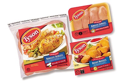
Springdale, AR-based Tyson Foods just announced a “world-class” packaging makeover to give its products a fresh, new look. The redesign puts more punch into the consumer appeal of its packaging; consumer research was instrumental in developing the new look. For example, design elements were placed in what Tyson calls a “strategic hierarchy that easily and effectively guides consumers’ eyes through the informational elements they need to read before making a purchase choice. To more easily connect with consumers, the new packaging is dominated by an eye-catching red color.” Red, Tyson believes, has appealing emotional qualities. “Even though red has long been used in the Tyson logo, we’ve now decided to incorporate it as the principal color in our new packaging,” explains Bob Corscadden, Tyson’s chief marketing officer. “Research indicates that claiming a color is one of the most cost-effective tactics for defining an easily recognizable package, since consumers visually identify a package’s color before its shape or texture.” Tyson worked with Lipson Alport Glass & Associates (Cincinnati, OH) to develop the basic package designs. Products containing any of eight major allergens will be emphasized in bold capital letters, and listed separately from other ingredients. Nutritional information will also be highlighted. Four new icons were created to provide at-a-glance tips on product style and preparation. A white chicken icon will include a message reading “chill, clean, cook” to reinforce proper preparation habits. A clock and “quick ‘n easy” verbiage indicates a simple preparation timeframe for frozen items. A microwave and “heat ‘n eat” message indicates that a fully-cooked, refrigerated item needs minimal preparation, while a white chef hat and “ready to cook” message identify convenience products. —JB