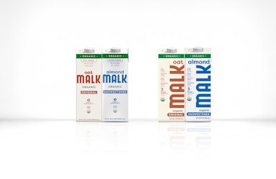
Malk Organics redesigned its shelf-stable almond and oat milk packaging in February 2025, shifting its brand name from horizontal to vertical layout to increase shelf visibility and consumer recognition without changing materials or production methods.
- Malk Organics redesigned packaging for Shelf Stable Unsweetened Almond and Original Oat products in February 2025
- The redesign shifted the brand name from horizontal to vertical orientation to improve shelf presence and visibility
- No changes to materials or production efficiencies—the same Tetra Brik Aseptic 1-L Edge packaging was used
- Malk partnered with Riser design agency to rebalance visual elements within the vertical footprint
- Early results show increased brand recognition and positive consumer reaction to the bolder, more confident packaging
Clear, confident packaging designs help beverage companies stand out to consumers and market products, and Malk Organics knew this when it launched redesigns for its Shelf Stable Unsweetened Almond and Original Oat SKUs in February 2025.
The plant-based milk producer from Austin, Texas debuted a new look for its products that reflects a bolder design with the brand name as the centerpiece. Stakeholders felt that the previous design was too constraining, and the company needed a way to make their brand shine more, according to Barrett Brynestad, Malk’s senior creative director.
“While the previous design helped us get this shelf-stable product to market in a way that was consistent with our refrigerated lines, the constraints of a narrow, flat-facing label were too restricting and resulted in a quieter-than-desired presence on-shelf,” Brynestad says.
Bringing the Malk brand front and center
 The redesigns make the Malk brand stand out above the product names.Malk Organics
Internal conversations about the need to better balance visual counterweights drove Malk’s redesign launch.
“The [previous design] constraint was coming through in trying to balance delicate, smaller elements. By pulling apart our previous approach and allowing ourselves to reorient design elements to better fit within the vertical footprint of the facing, we struck a new balance and impact,” states Brynestad.
Malk says the balance it achieves with the redesign also gives it a more confident shelf presence.
“[The redesigns] speak to the consumer in a clear, direct manner. No whispering here. This is Malk, and if you didn’t see us before, hopefully now you will,” Brynestad adds.
One of the most notable changes to the oat and almond product designs is a shift from Malk’s horizontal brand name layout to a vertical one. The motive for this change is rooted in having the Malk brand be more recognizable and impactful than the variety, flavor, or ingredients.
“We wanted the hierarchy to be clear to connect the dots within the retail footprint: Malk [is recognized first, followed by] Almond and Oat, then SKU specific. The brand needs to jump off the shelf in a way that wasn’t happening before. Same great Malk, now available in a new aisle and form factor,” Brynestad explains.
Malk’s packaging redesign might still be fresh, but Brynestad says brand recognition is already increasing.
“[Consumers have had a] positive reaction. We’ve heard that customers are beginning to see us outside of the refrigerated section, and this bold refresh is leading that charge,” Brynestad states.