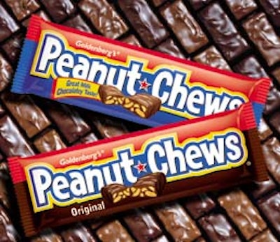
The old package was fairly simple with only a red-and-blue stripe to add color. Denise Bosler, a designer with Bailey, wanted to keep the red because it was a source of recognition for Goldenberg’s loyal customers. But because the candy has been around since 1890, she wanted the new look to appeal to a younger generation. The bright new packaging uses custom hand lettering for the logo as well as a vignette of the candy cut in half. This was necessary because research had shown that consumers wanted to know exactly what they were purchasing. The new packaging, which is flexo-printed in seven to eight colors, began hitting store shelves early this fall.
Companies in this article