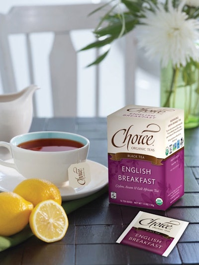
For Choice Organic Teas, the redesign of the packaging for its Original tea line could be likened to polishing a gem. While the Seattle-based company—the first organic tea crafter in the U.S.—has maintained the core elements of its design to preserve the brand equity, the packaging’s colors, artwork, and messaging have been refreshed and refined for a more modern look.
“From a design point of view, the design cues [for organics] in packaging have shifted. In the early days, natural consumers looked to rustic packaging to connote ‘natural, organic, healthy’ products and earth-friendly packaging,” relates India Nagy, graphic coordinator for Choice Organic Teas. “Organic, healthy ingredients and environmentally friendly packaging are more important than ever as the category has evolved. However, consumers are more sophisticated, and they are looking for indicators of a more refined experience.”
Packaging for the Original line, first introduced in 1989, comprises staple-free tea bags made from unbleached paper, packed in paper-crimp, compostable envelopes. Sixteen envelopes are packed in a secondary carton made from 100% recycled paperboard.
For the redesign—a two-year project led by Nagy—Choice Organic Teas retained the packaging’s iconic layout: a block of color on the bottom three quarters of the carton, topped by the brand logo in calligraphy against an off-white background. Design updates included deepening the color palette of the boxes to much brighter, more saturated colors.
A local artist was commissioned to create a subtle illustration of tea leaves that appears in the background on the colored portion of the carton. The logo was refreshed by the calligrapher who created it more than 20 years before, making it easier to read. Copy of the tea variety—there are 26 in all—is presented on the front of the carton, allowing consumers to distinguish between white, green, oolong, black, and herbal teas. The graphic design of the carton is then mirrored on the individual envelopes that hold the tea bags.